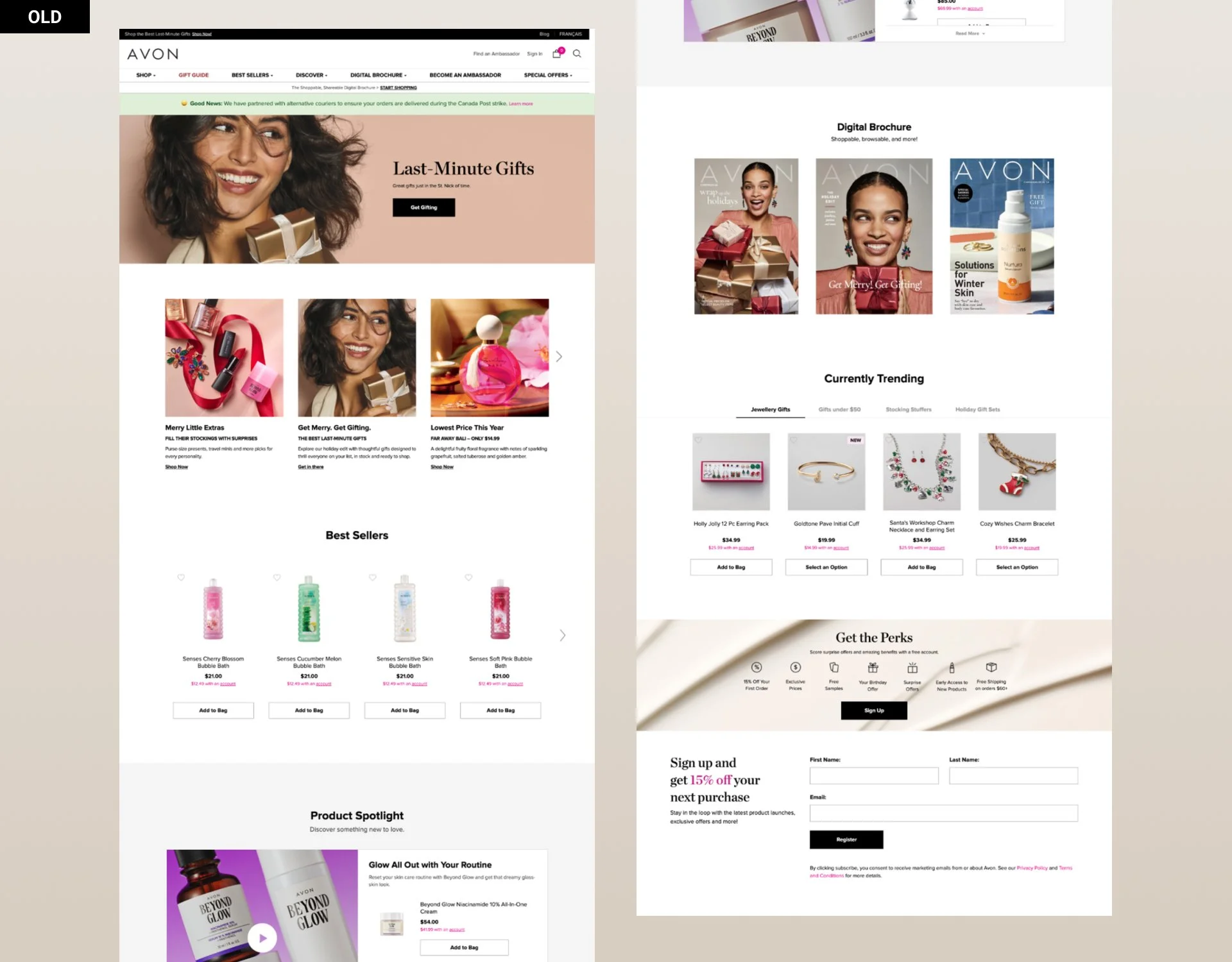
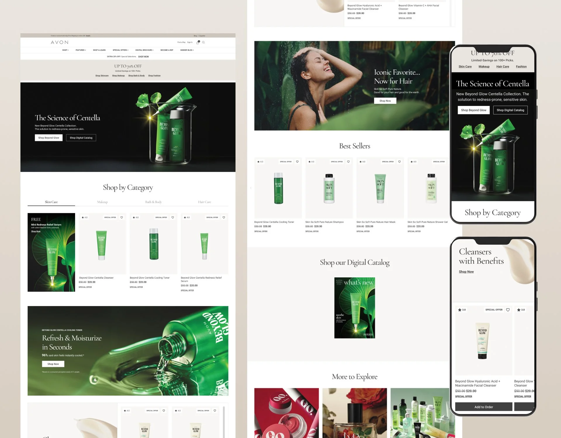
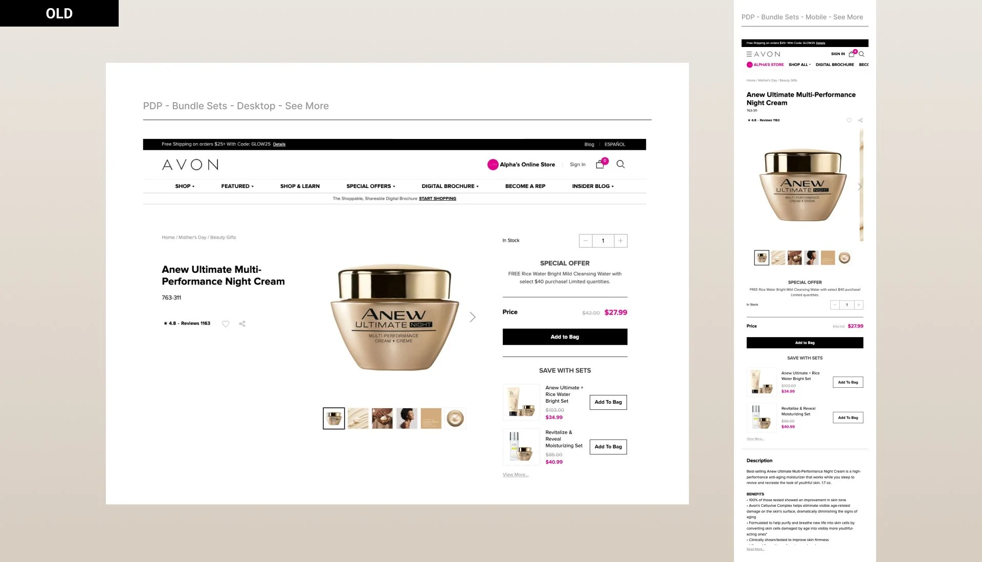
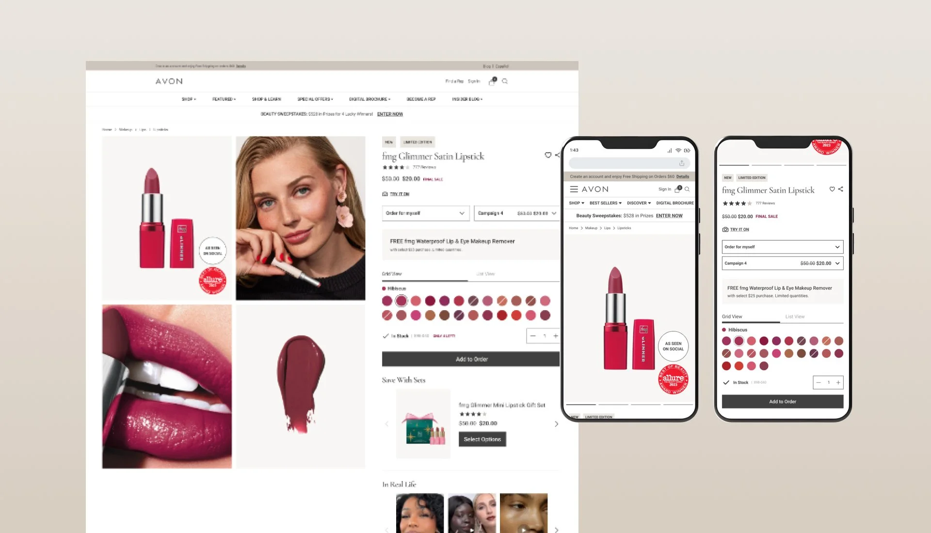
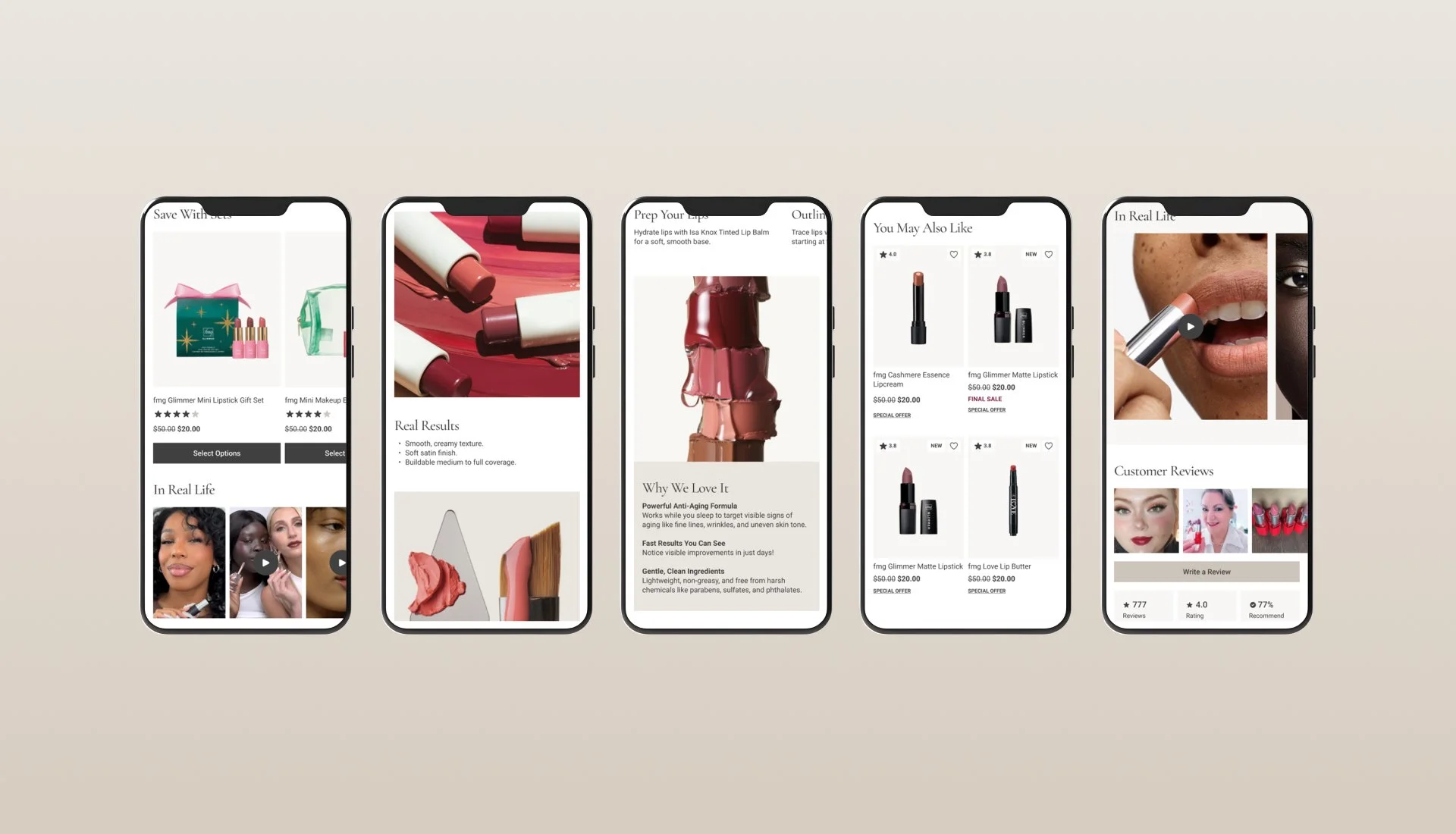
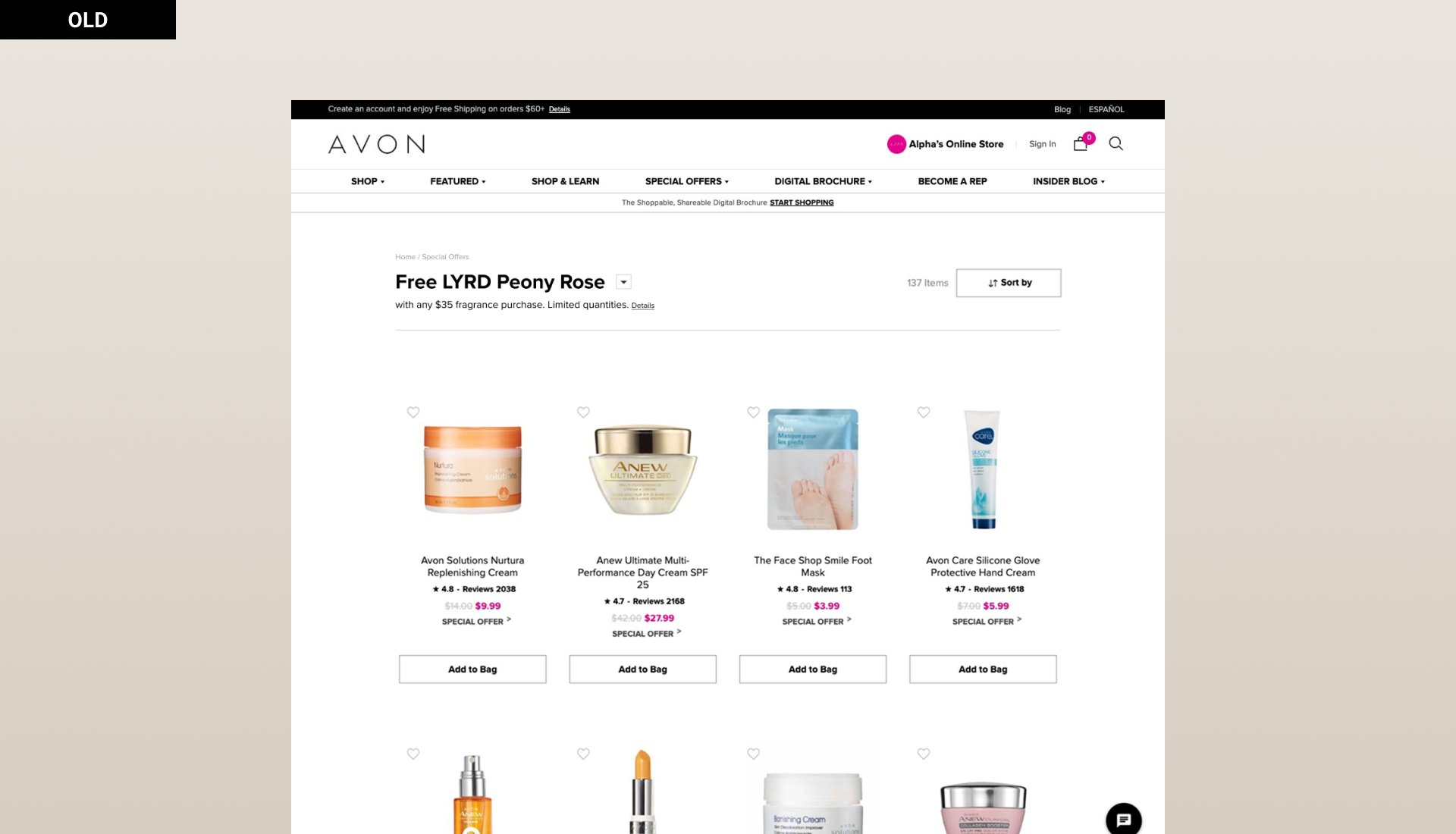
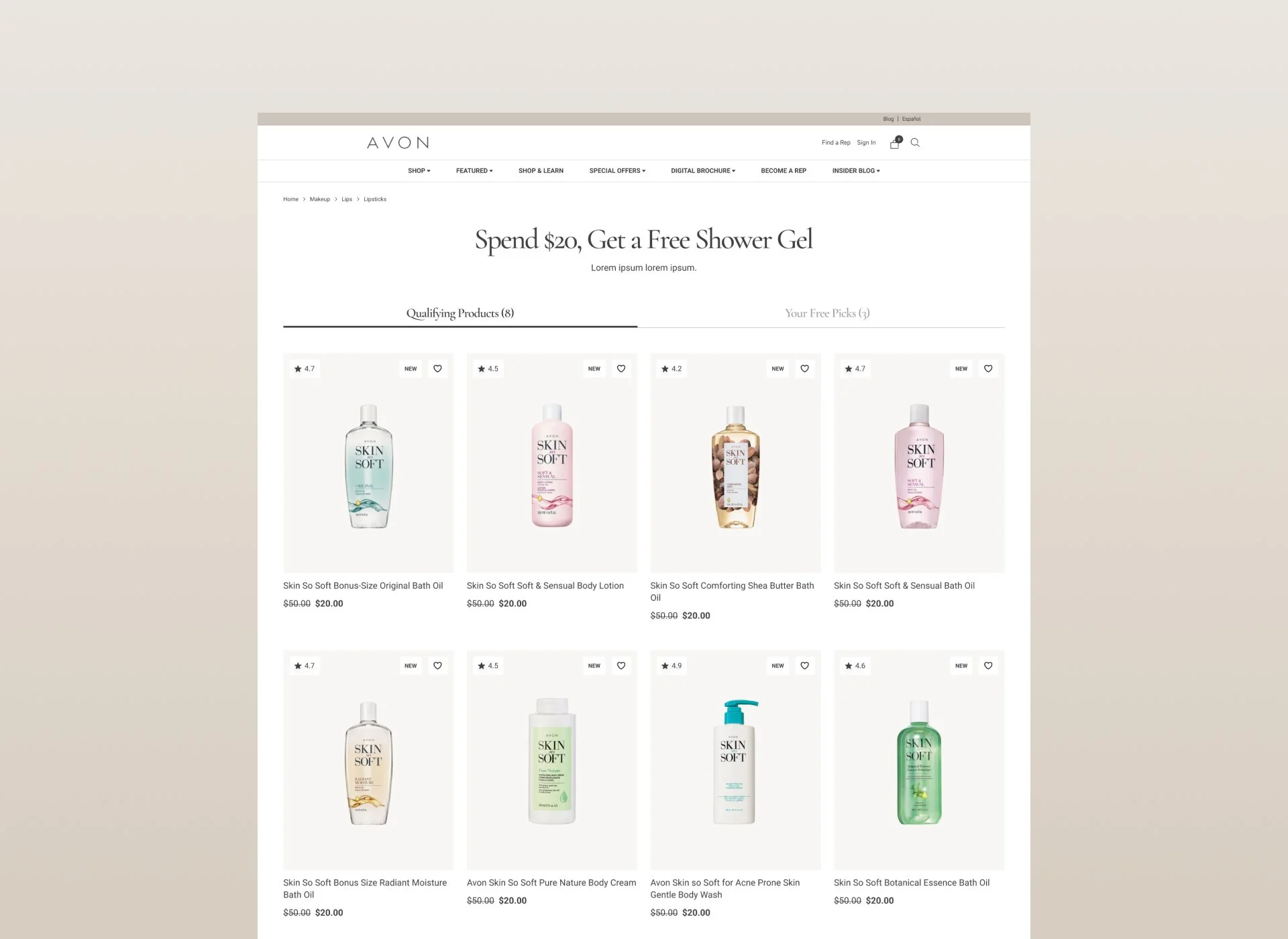
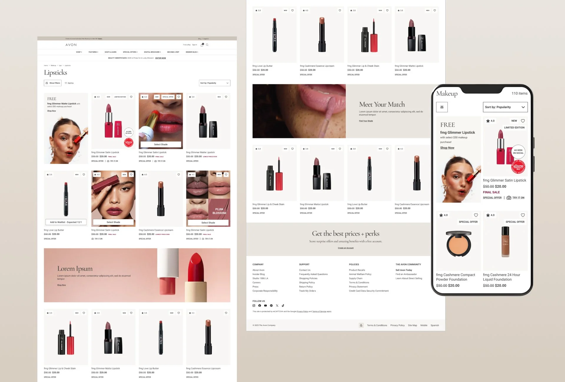
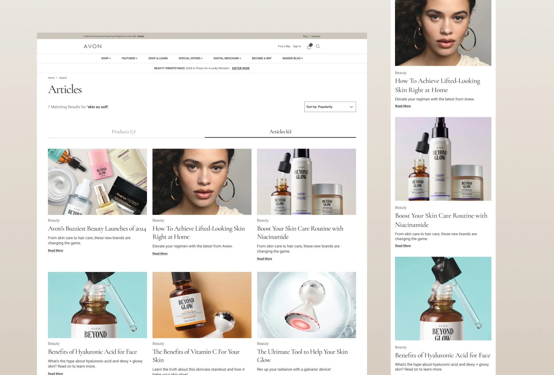
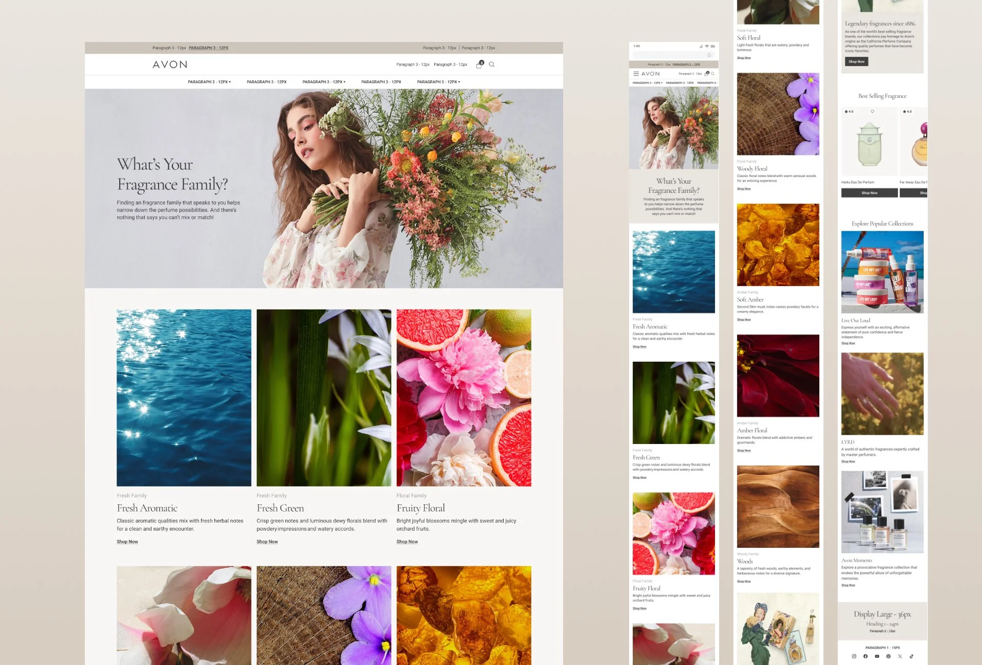
Site redesign and UI/UX overhaul. The goal was to create impactful updates that set a solid foundation for future improvements, with minimal tweaks such as updated type, visuals and flexible modules.
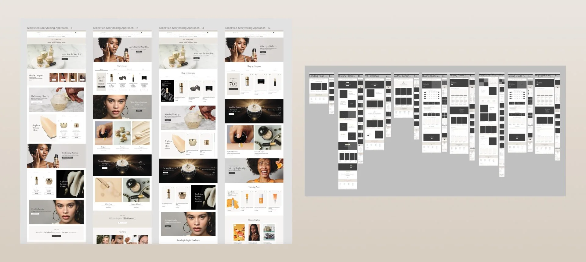
This project involved months of ideation and competitive research to identify the most optimal visual design and strategy for the Avon brand experience.
Challenge: The challenge for Avon was finding the right balance between promotional urgency to drive sales and strong branding to build trust and relevance.
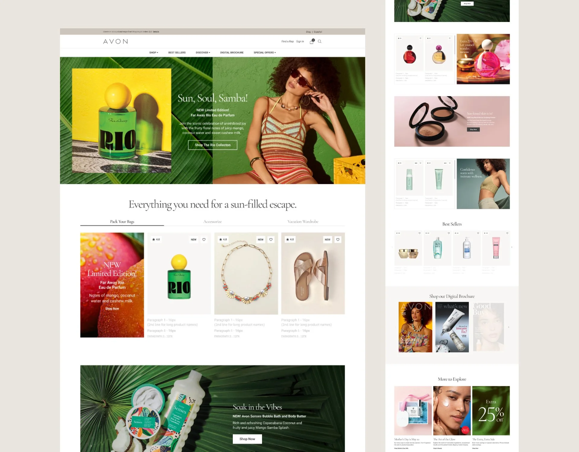
Solution: A simple, engaging homepage that combines research insights, storytelling, and clear navigation to meet user needs and drive sales.
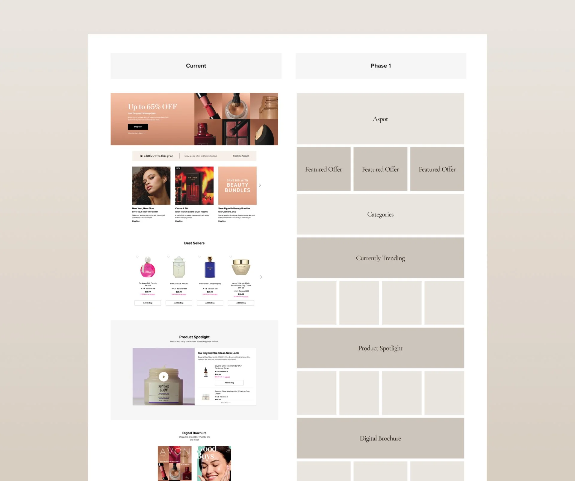
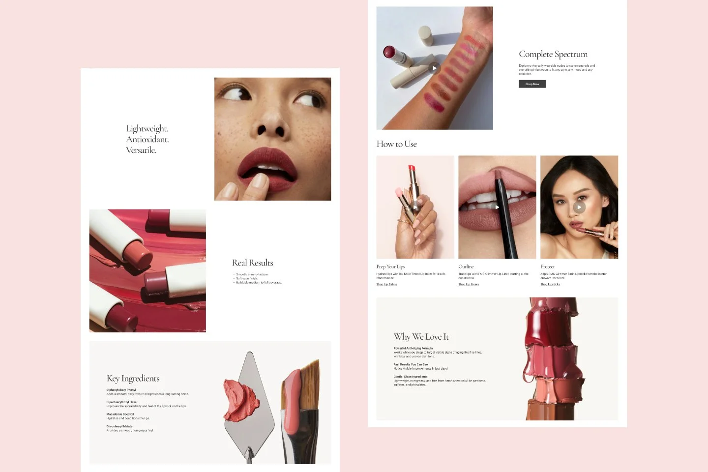
We explored multiple iterations of the landing page with flexible, multi-functional modules that could be mixed and matched to accommodate the various e-comm needs of the business.
Full-screen visuals: Large, high-quality images / campaigns for immediate engagement and brand storytelling.
Grid-based showcases for products: Organized grids to make it easy for product discovery.
Strong visual hierarchy: Harmonious balance with banners and prominent CTAs to make shopping easier.
Fast loading pages: Lightweight images to optimize loading time and improve customer experience.
Clean layouts: Minimalist designs to emphasize product visuals and CTAs.
Interactive Features: Hover effects and quick views to allow faster browsing and less work for the user.
Neutral / muted monochrome tones: Beige, gray, pastel shades, black and white to be easy on the eye and to have more focus on product/promotions.
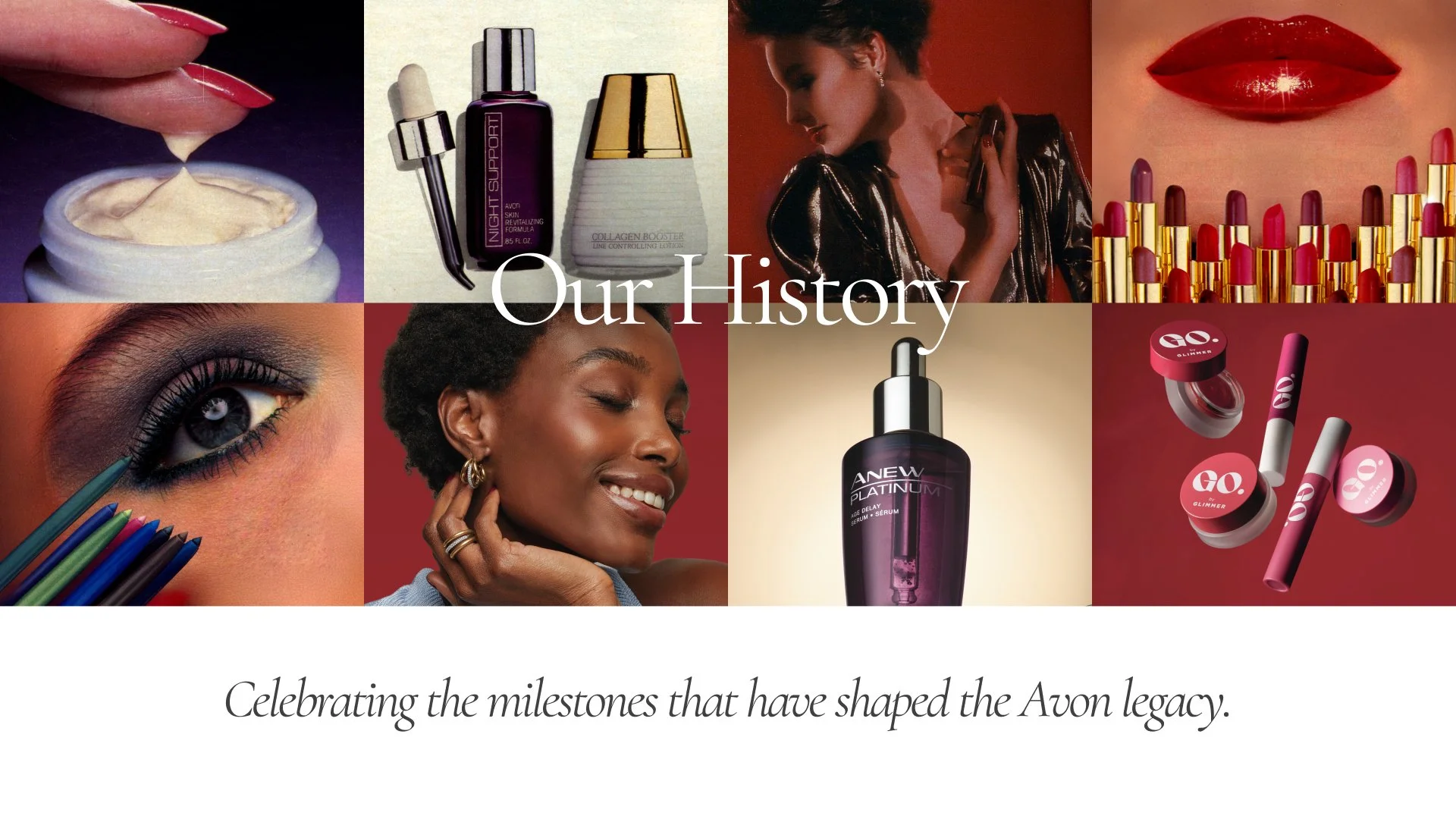
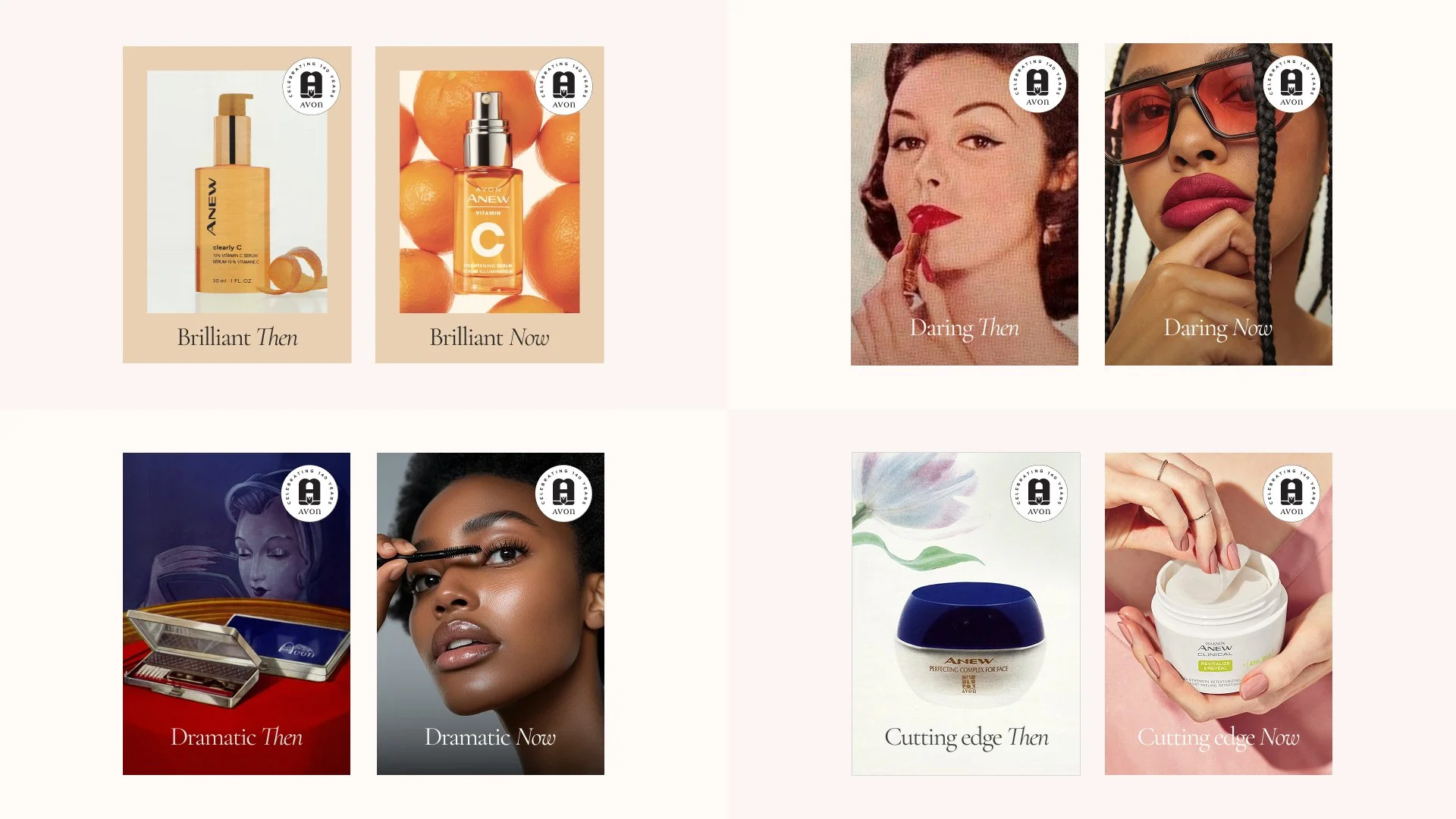
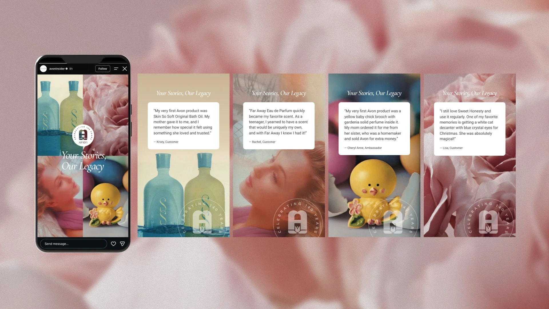
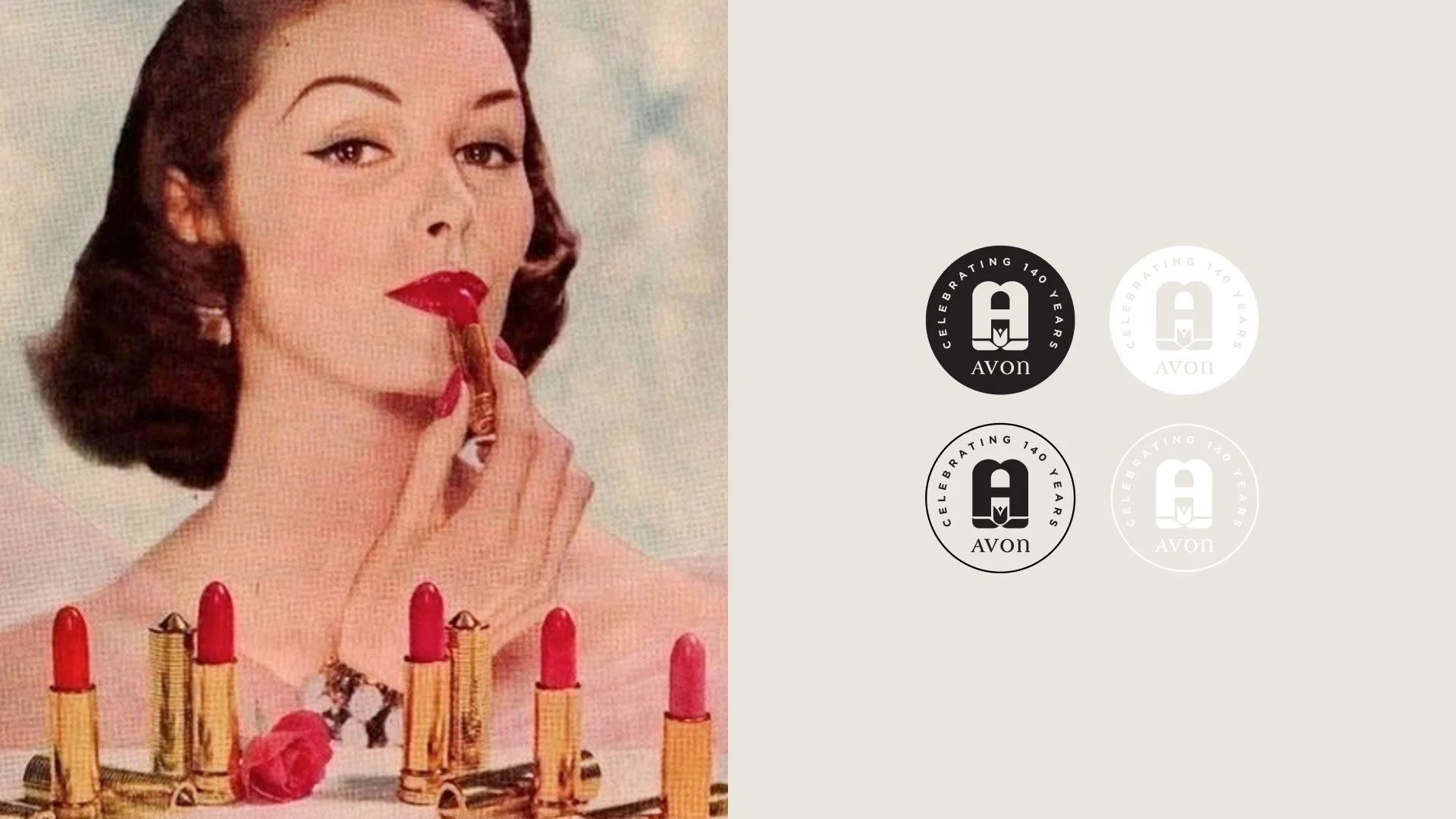
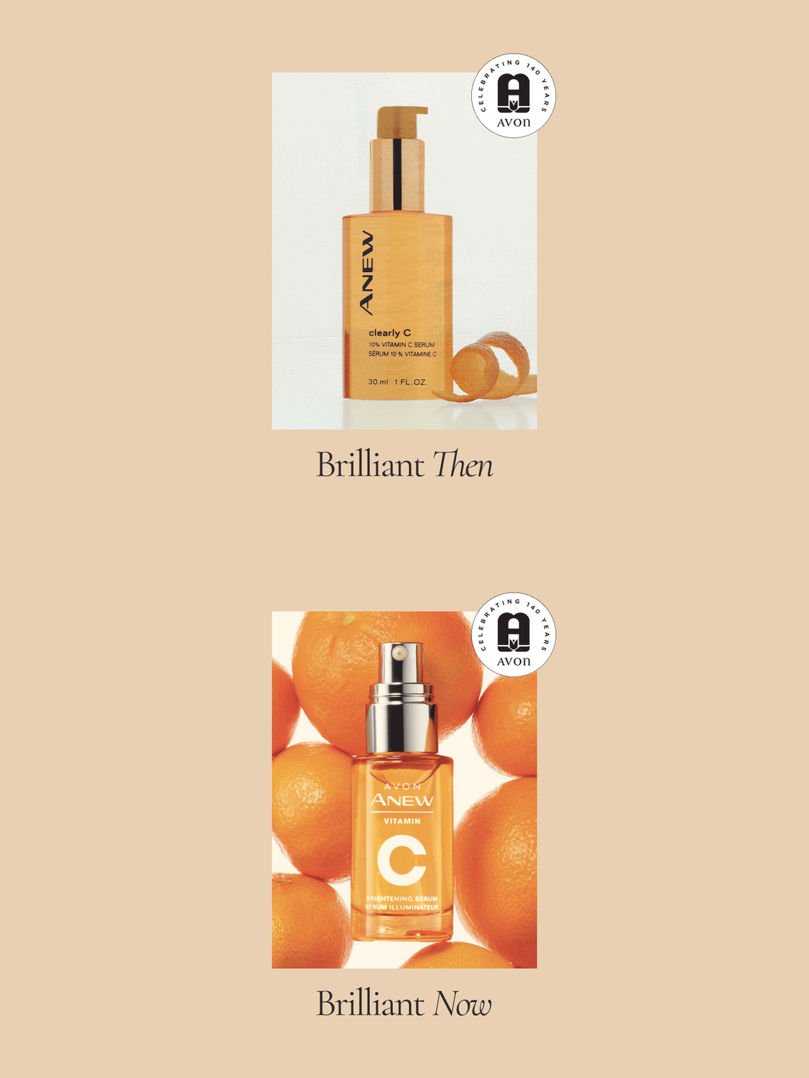
To celebrate 140 years of Avon, we created a digital-first experience that highlited the brand’s rich legacy. The goal was to make Avon’s history feel relevant—not simply something to look back on, but a powerful part of the brand story that could drive engagement, discovery, and sales.
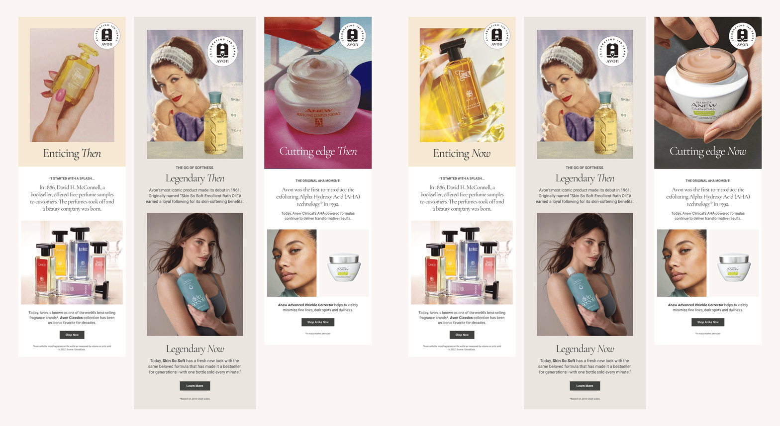
The project highlighted the people, products, and stories that have shaped Avon over the decades, translating its history into engaging e-commerce experiences. We developed landing pages, promotional campaigns, logos and badges for legacy products, email communications, and a range of digital assets designed to connect Avon’s heritage with today’s customer.
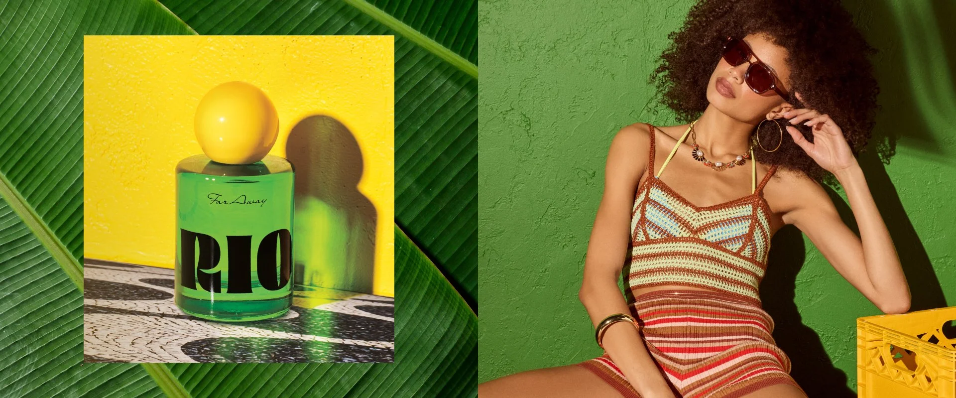
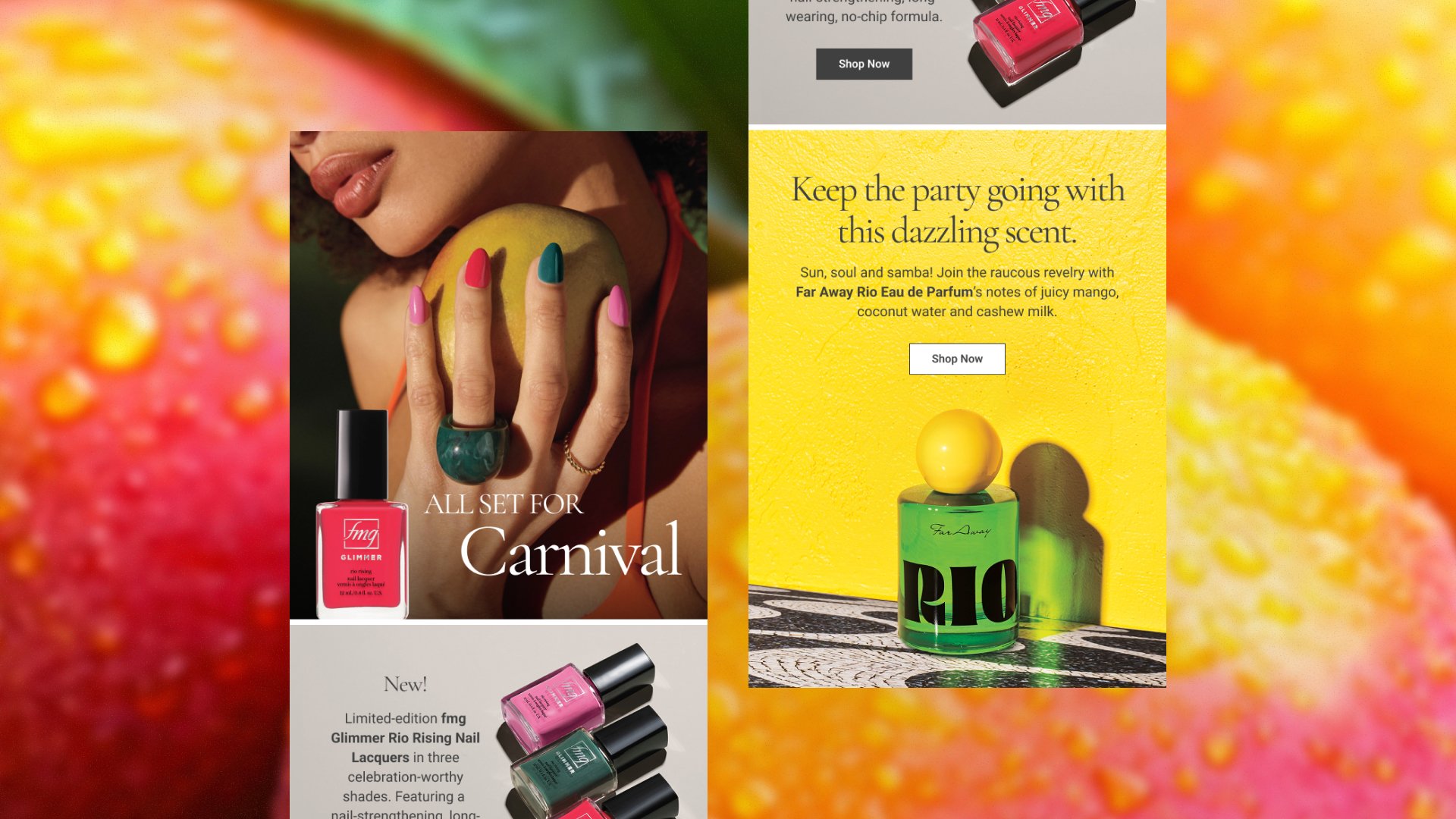
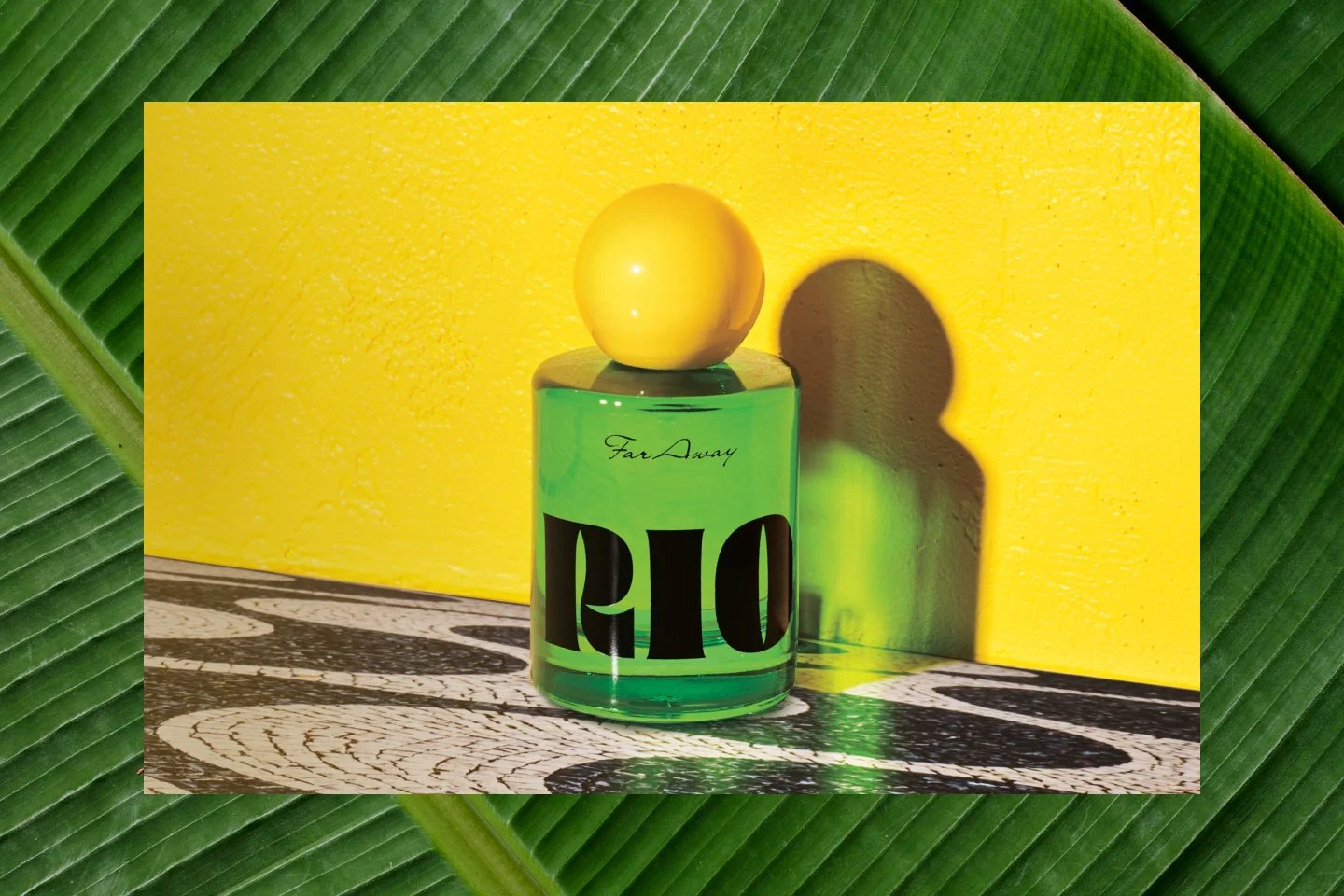
Digital assets for the launch of Far Away RIO. A bold, colorful, and tactile visual language was developed for digital assets, capturing the easy, luscious, tropical essence of the fragrance.
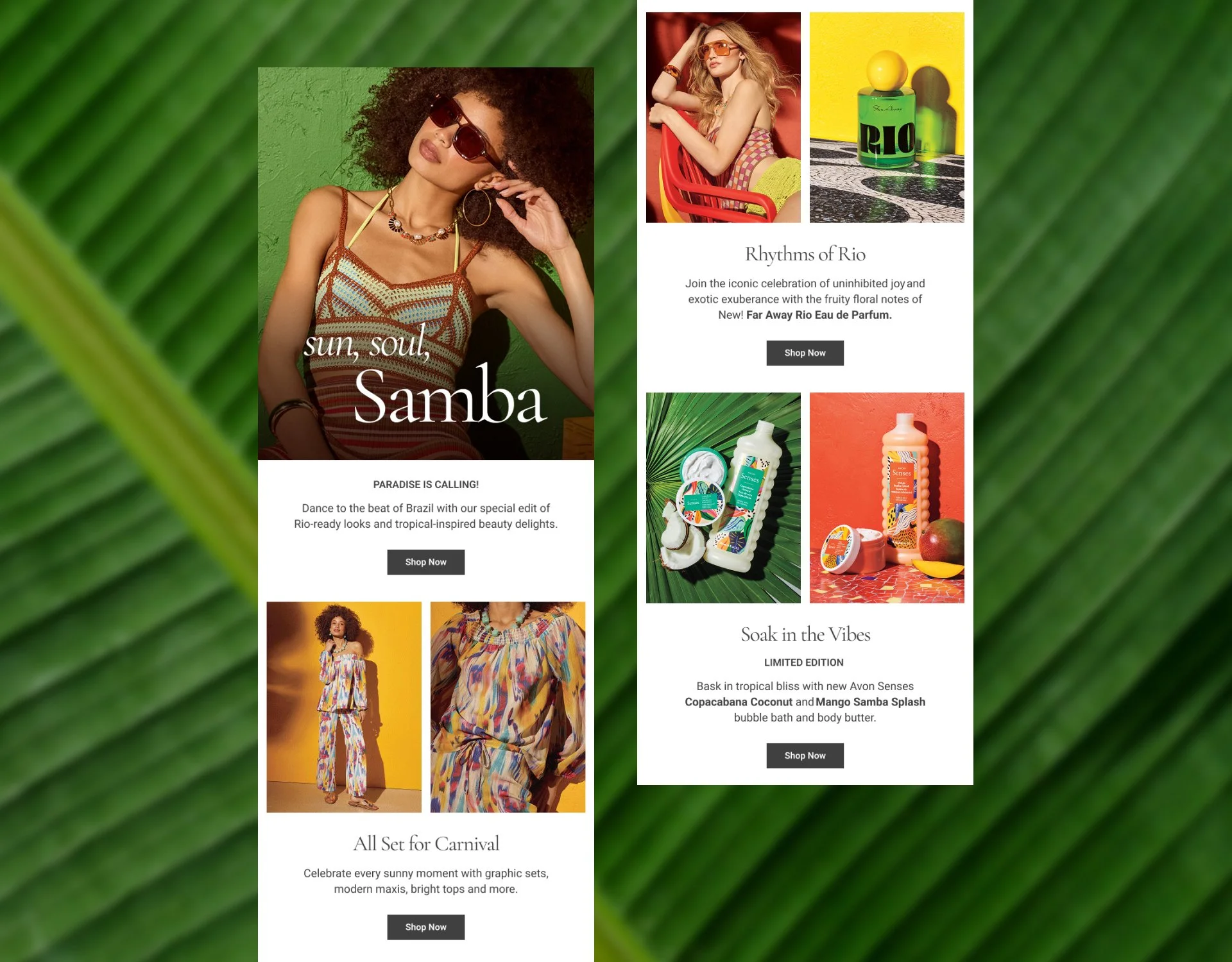
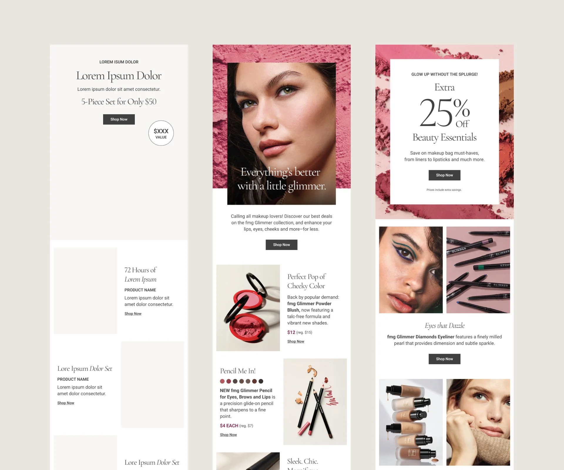
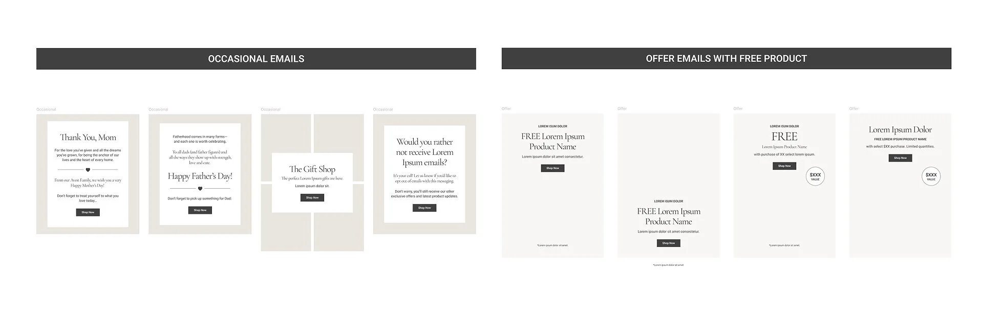
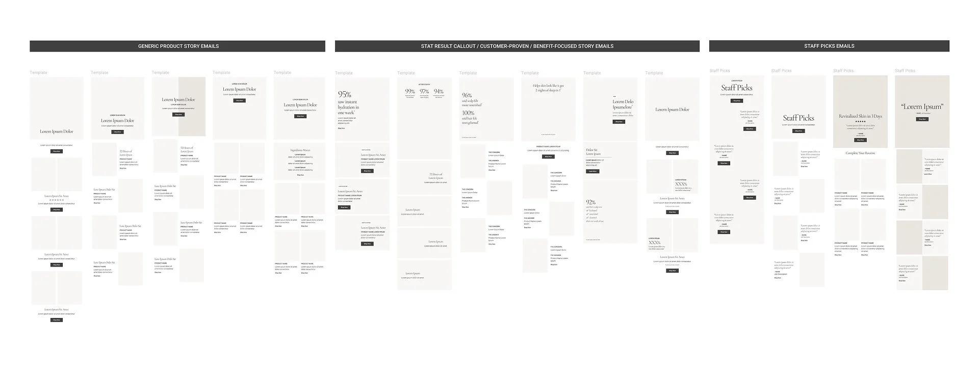
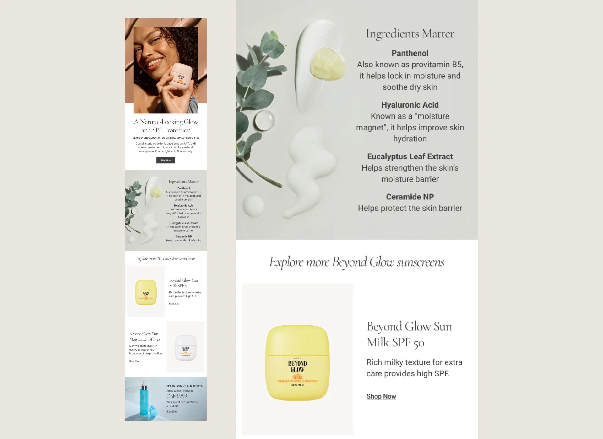
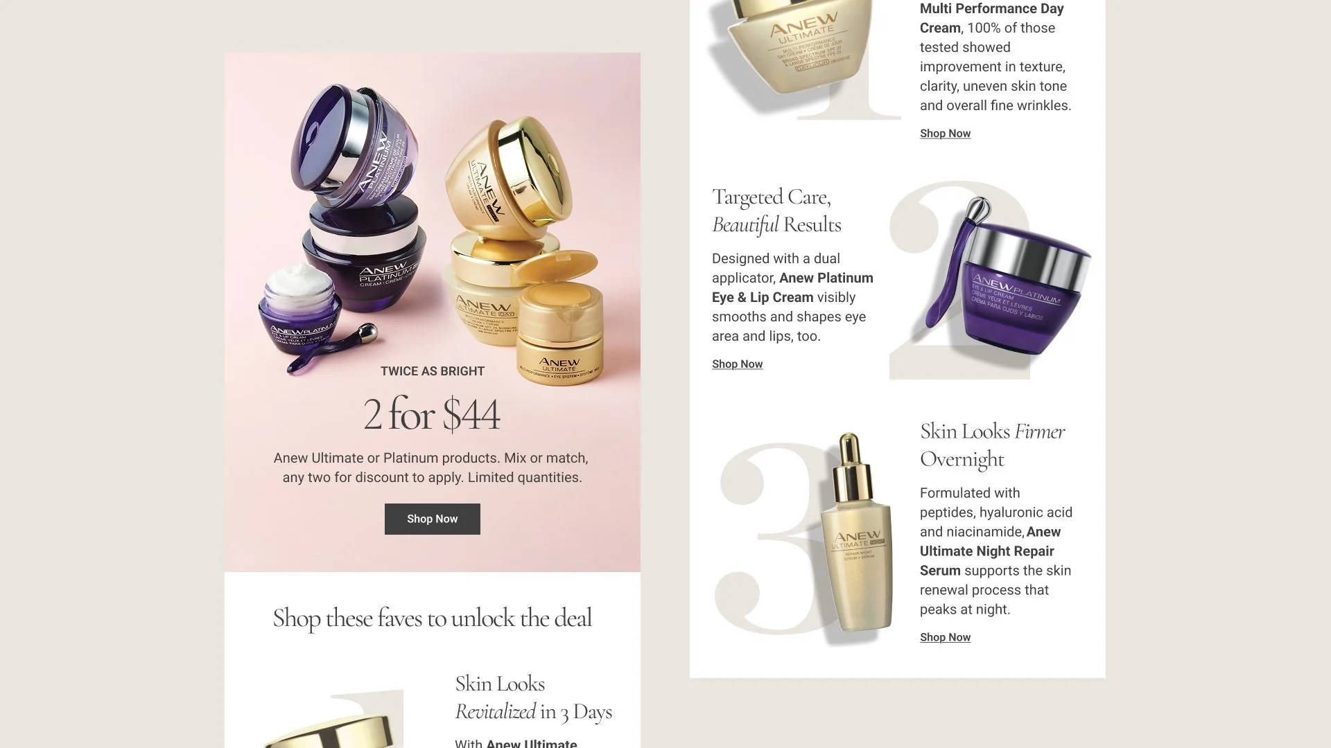
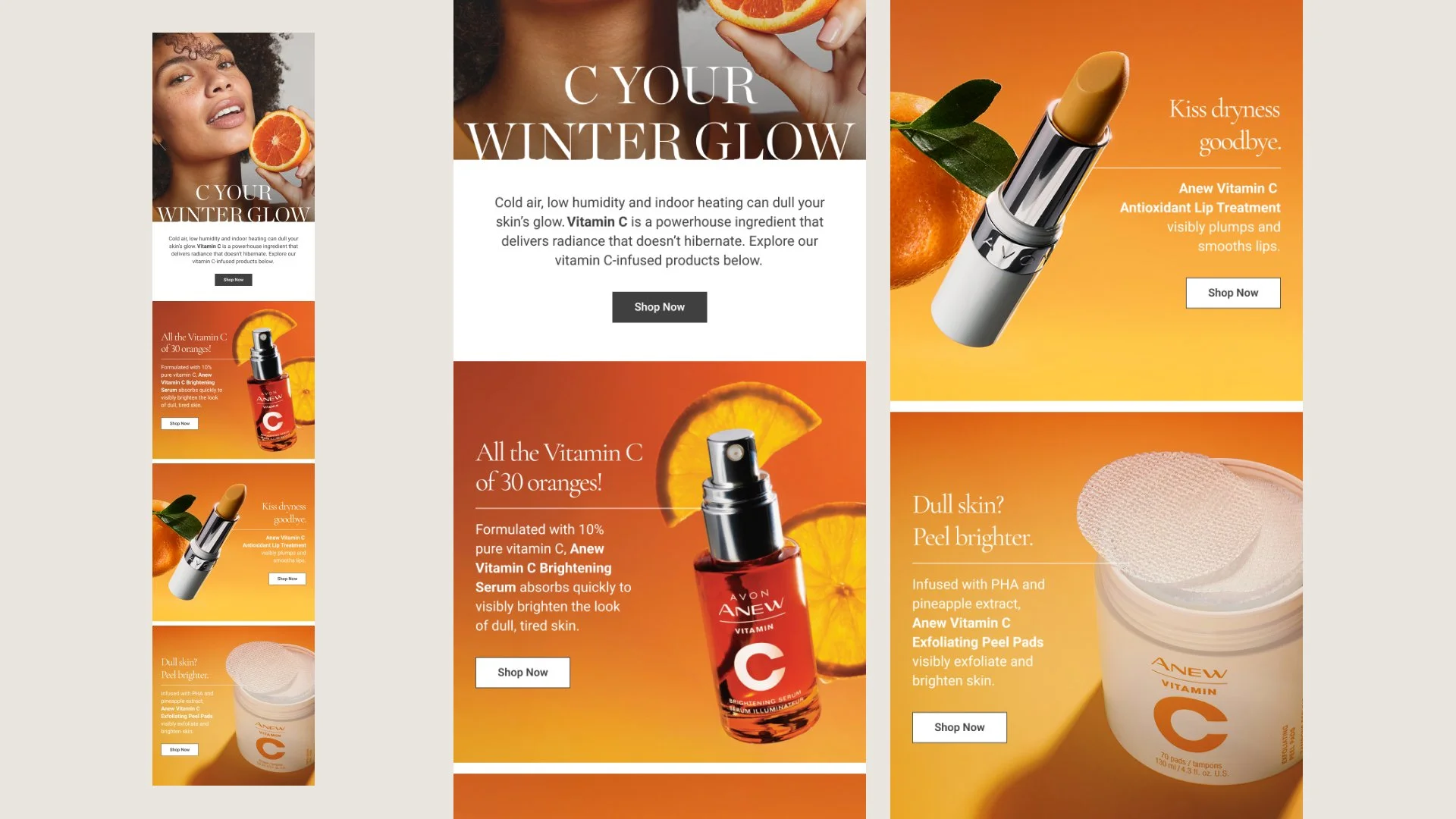
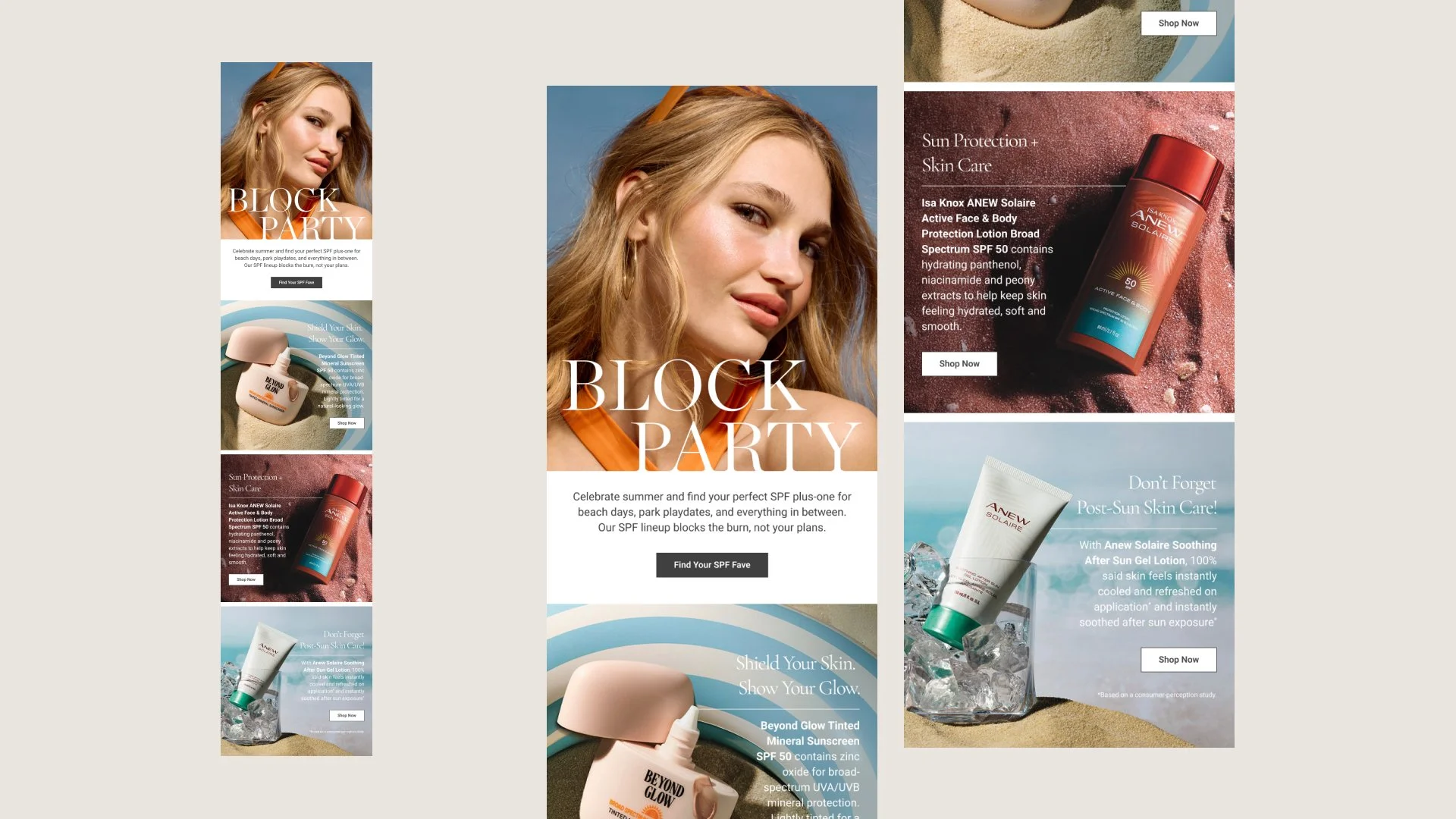
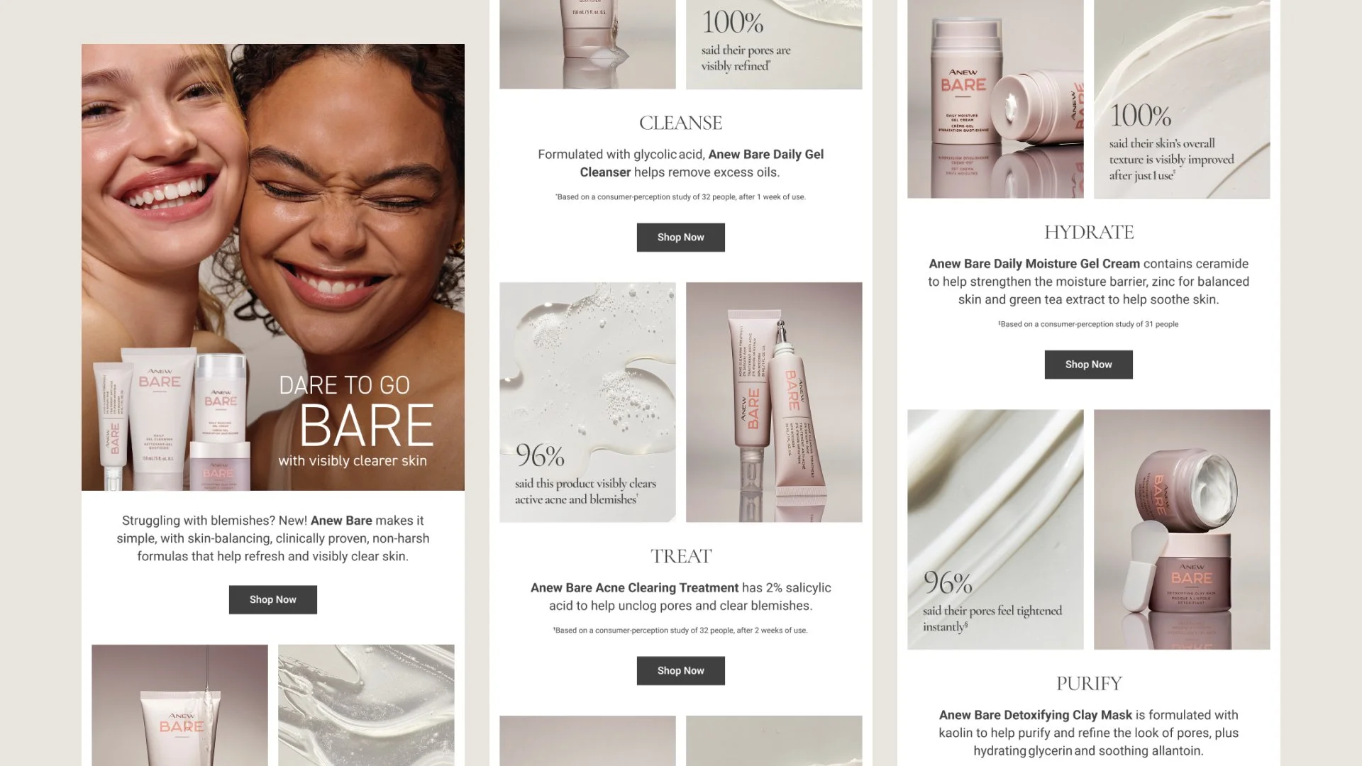
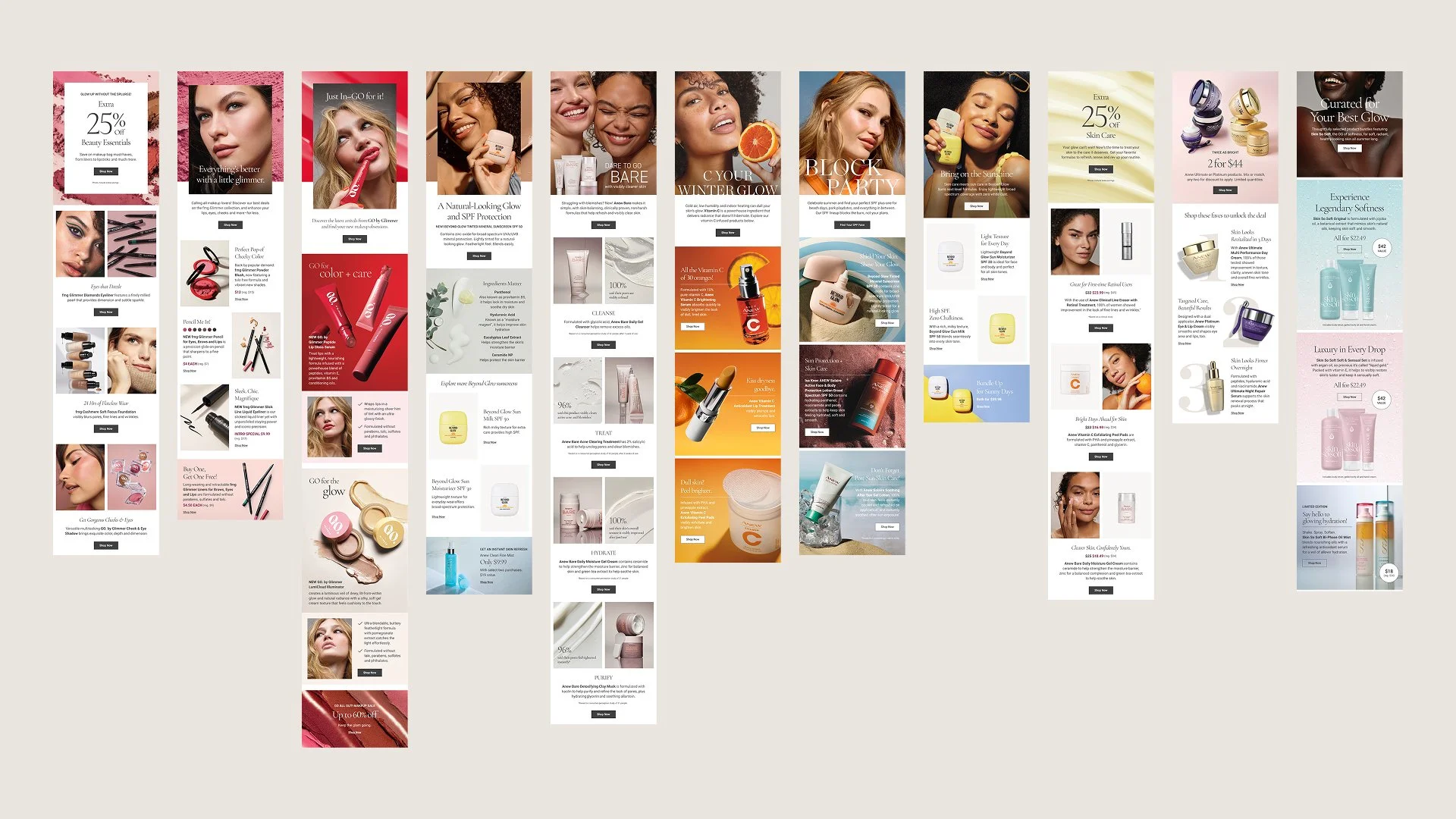
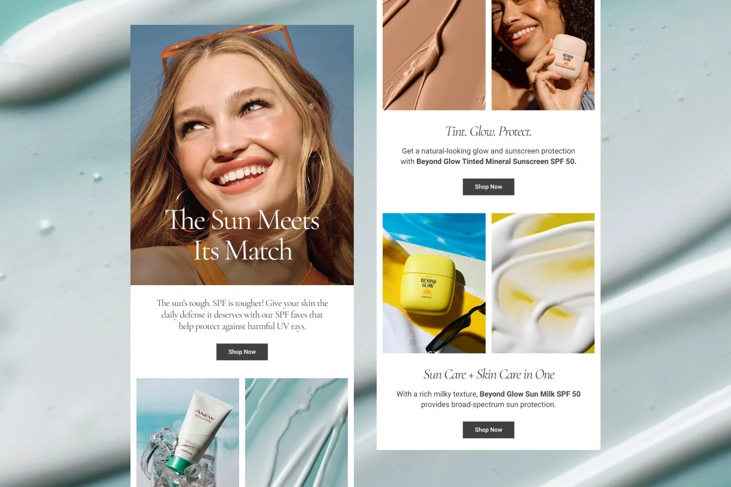
A flexible email design system built to make creating for Avon faster and smarter, while maintaining visual consistency across the board.
This project showcases a range of marketing emails alongside the templates, wireframes, components, and modular building blocks behind them. I created a flexible library of reusable elements that could be mixed, matched, and adapted to support everything from product launches and promotions to seasonal campaigns.
By designing the system behind the emails, the team could create polished, on-brand communications more efficiently.
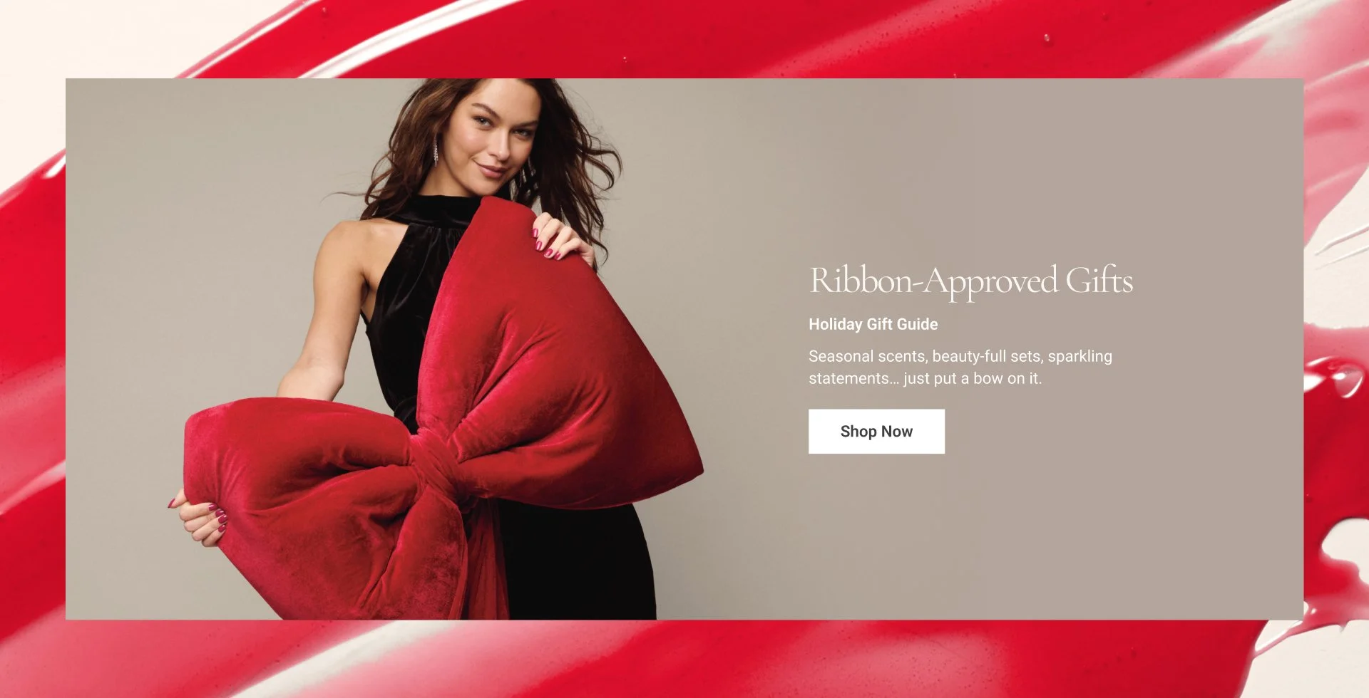
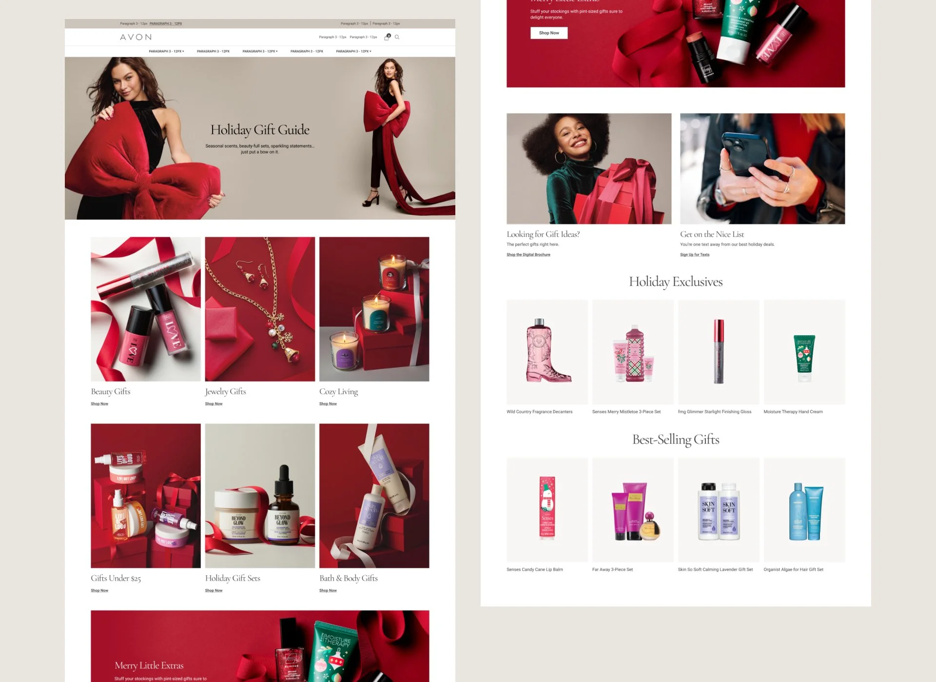
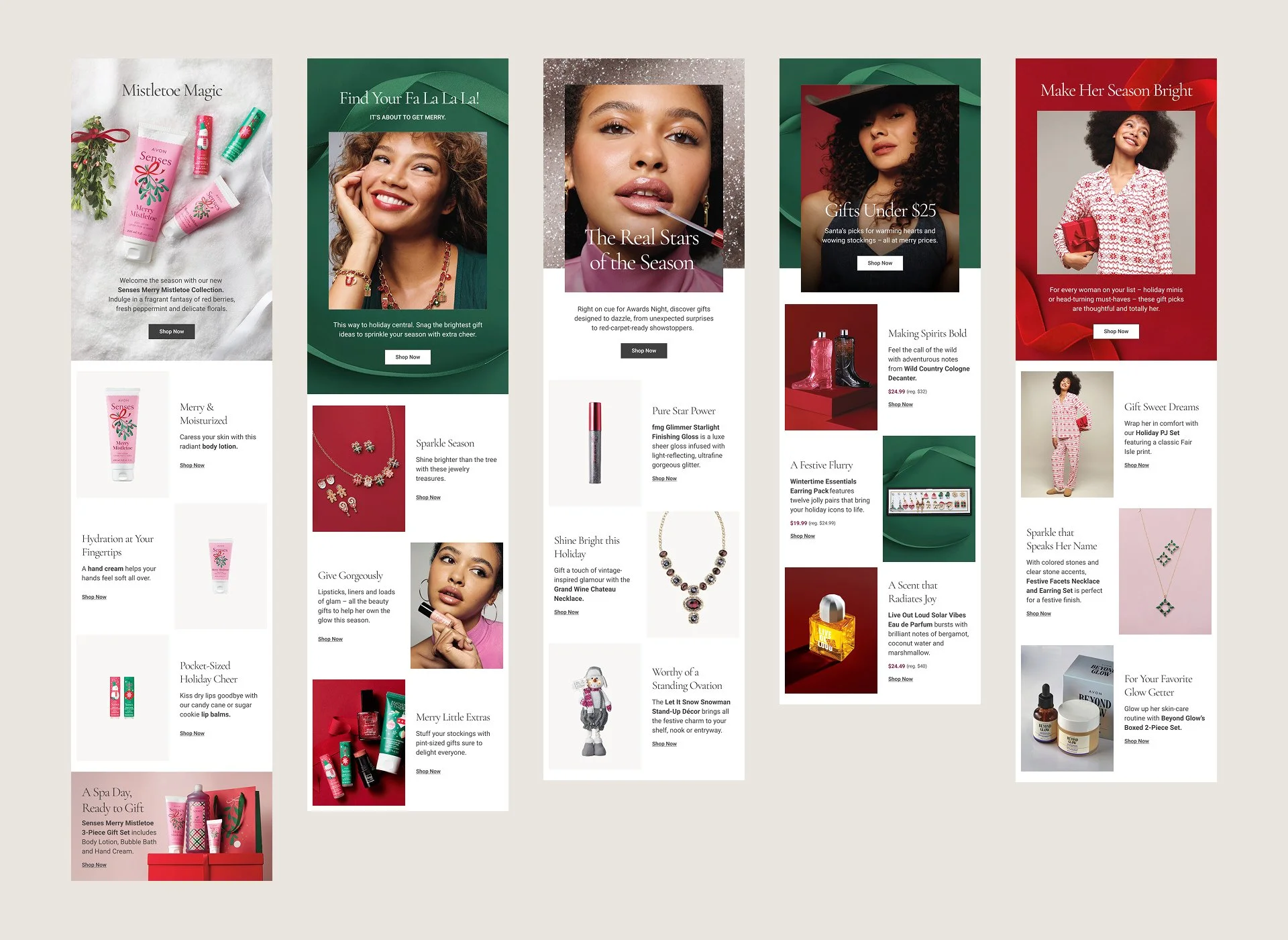
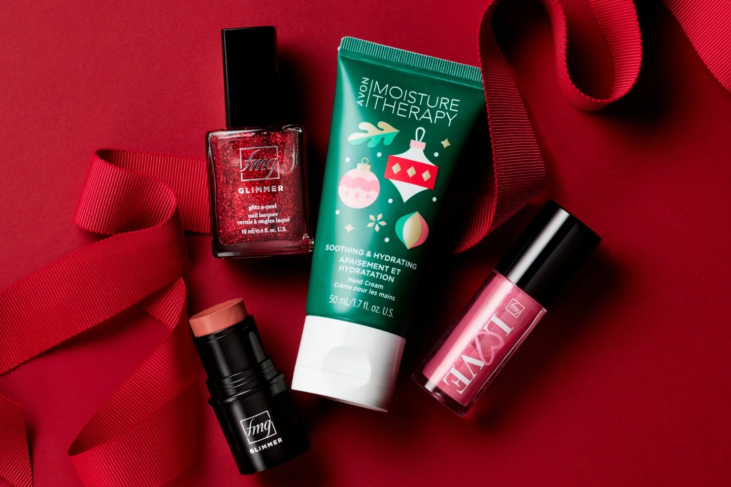
Site assets and emails for the 2025 holiday season.
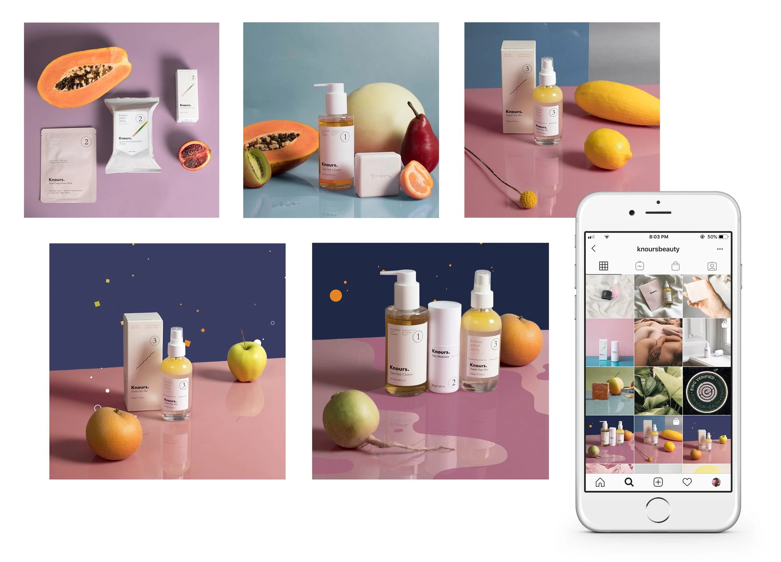
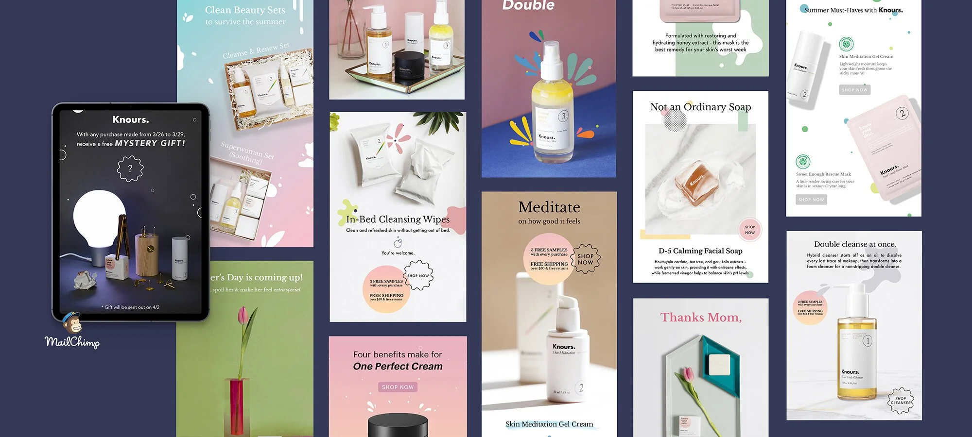
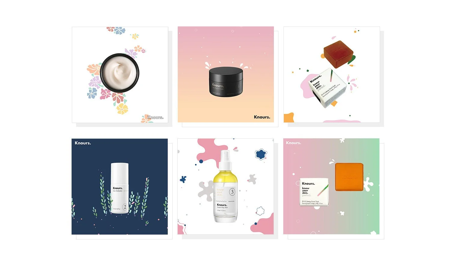
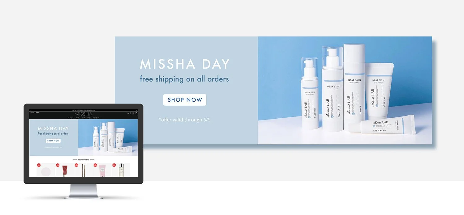
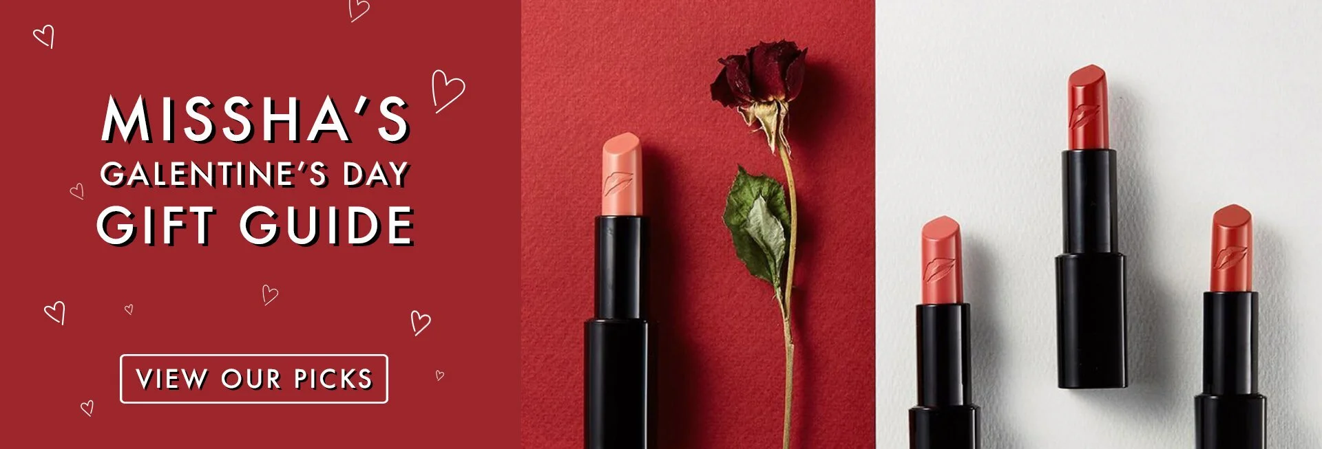
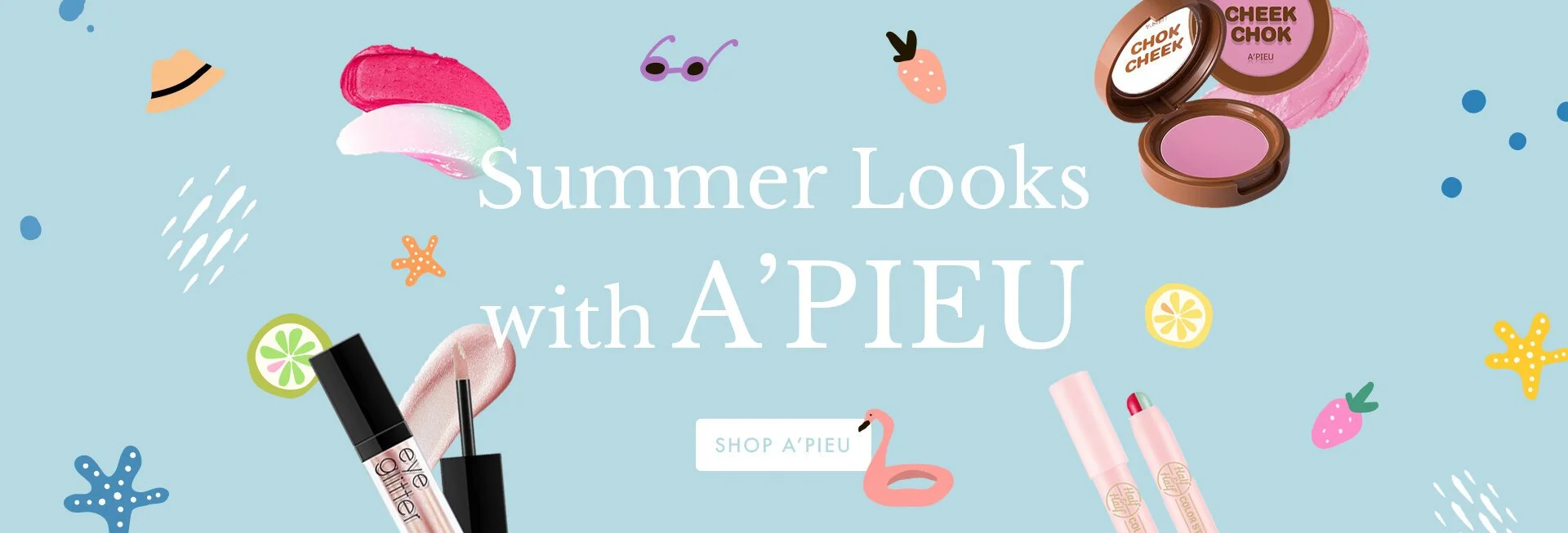
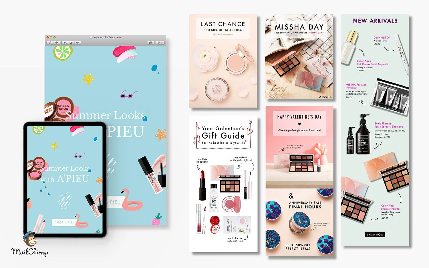
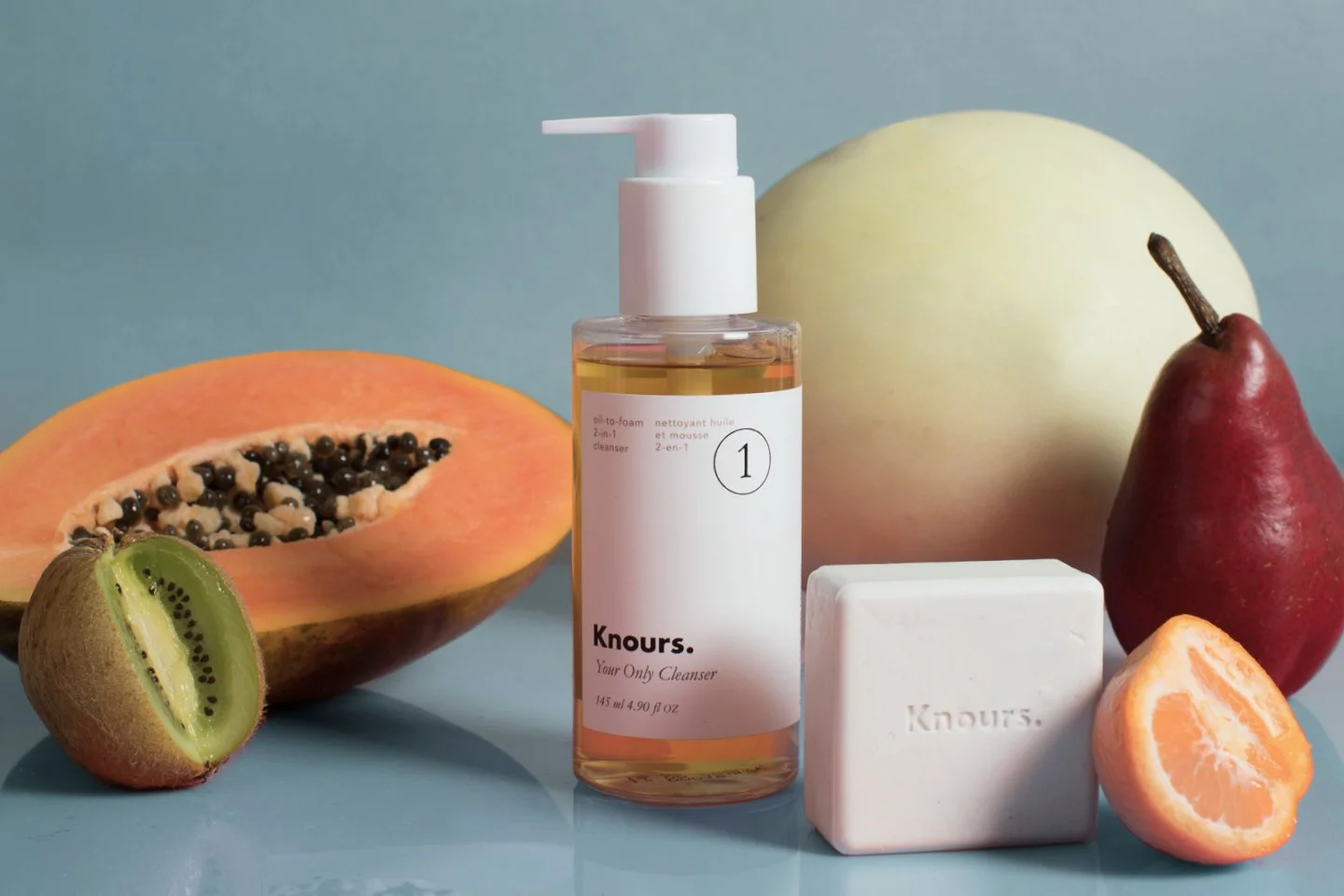
Social media, site, and print assets for K-beauty brands Knours and MISSHA.